April 30
I'm starting a portrait of Shasta, an Australian Shepherd. It’s a gift from Diane Barnes to her son Takeshi. Takeshi’s girlfriend Cheryl (now his fiancé) has been part of Shasta's life for many years too. Cheryl wrote,
“Shasta is now 10 years old, and I came into her life when she was 3 when I started dating Takeshi. They share one of the closest bonds I have ever seen between a pet and their owner.”
The decision was made to do a full-body portrait of Shasta in a Fully Detailed Background scene. If you've watched my portraits develop you know there is quite a decision-making process in designing the layout, before I ever put pencil to paper. This album shows that process.
1
The first step is choosing which reference photo(s) to use for a portrait. Sometimes a client has a favorite and the decision is clear from the start. Other times they are not sure, and my job is to guide them in narrowing it down. Diane, Takeshi (Tk), and Cheryl sent 58 photos of Shasta. There were only a handful of full-body shots. Sometimes I can combine the body from one photo with a better head shot from a different photo. I sent this pic, showing what I consider the best head choices for a portrait. Ultimately these decisions are Tk’s, since Shasta is his dog, and the gift is to him. Cheryl gave helpful input and suggestions.
The top row are the five I consider the best for a portrait. The bottom row are photos of Shasta looking cute and sweet. I wanted to give Tk the option if that was the look he loved the most. He chose number 2, an excellent choice.

2
What made the choice even better is head 2 was from one of the few full-body photos of Shasta, and probably the best full-body photo! So this is the photo of Shasta I’m starting with. Now on to the background….

3
Tk and Cheryl didn’t know what kind of scene they wanted. Some of their photos showed Shasta in different parts of the U.S. I suggested a mountain background with a lake. This is my crude layout to show them how it might look, using the existing grassy foreground in Shasta’s photo. I asked if they had a favorite mountain that was meaningful to them.

Cheryl suggested Mount Douglas on Vancouver Island, where Tk lived, a place they had hiked with Shasta many times. I found photos of Mt Doug, but it was not a very interesting background scene. Takeshi decided he would rather have a scene in the forests of Vancouver Island where he had hiked for years with his beloved dog.
4
I needed to add Shasta’s feet before placing her on a hiking path. This shows how I can add pieces using different photos. It’s tricky and doesn’t always work. I took Shasta’s feet from the photo on the right, after sizing it to match the other photo, and ended up with the figure in the center.

5
Next I searched for reference photos of “Vancouver Island forest”. I found dozens, pulled out a few to use as a starting point, and tried Shasta in each of them. None looked very good.
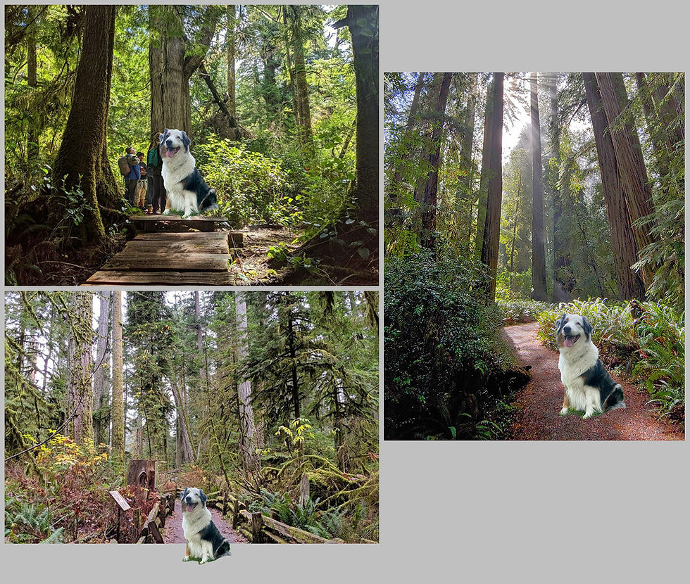
I was still hunting for the right scene.
6
Luckily, I live on the coast of Oregon and our coastal forest is very similar to that of Vancouver Island on the west coast of Canada. Similar climate, similar species. I’ve taken hundreds of photos while hiking in coastal forest. I created two examples of Shasta in forest scenes that I constructed from my own photos.
This is Scene 1 - Forest bridge

7
Scene 2 - Forest path
This is actually redwood forest, which doesn’t grow north of Oregon. So I would have to make a lot of changes to the trunks of the trees and their foliage.

Tk chose to go with the Forest Bridge scene.
8
To give you an idea how much design-work is needed even with a good background photo, this is the original photo I started with. With Shasta plopped down on the bridge just to see how she would work in the scene. (That’s my Good Boy Troy at the far end of the bridge in my photo.)
It’s a nice scene but Shasta is too small. For a portrait I want the subject to fill most of the composition. But if I just crop it around Shasta I will lose the forest and the hiking path. And the railings are ugly. There’s a lot more work to perfect this scene. I have to make a lot of modifications by taking the photo apart into pieces with Photoshop, and moving them around and resizing them.

9
This is the final layout, approved by the client.

Next I choose my paper and get in the studio and get to work with colored pencils.
Shasta's portrait will be a Fully Detailed Background portrait, one of my 5 portrait types. Each portrait type has a different price range. You can read about my types of portraits, see a gallery of examples, and their prices HERE.
Shasta portrait in progress 2
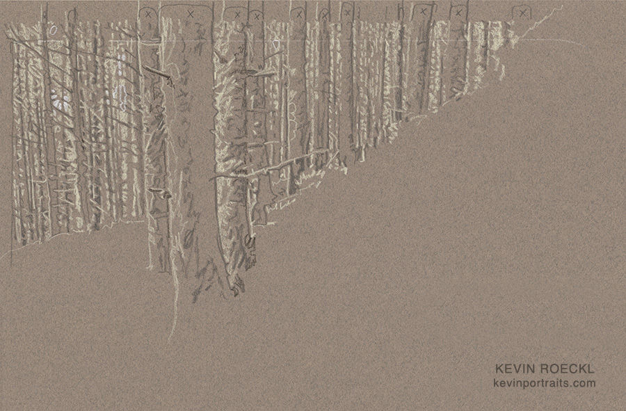
The first 3 days work on Shasta’s portrait. I’m working on a sheet of “Felt Grey” Canson paper, my favorite background color to work on. It works great for the distant forest trees because that shade of grey is the predominant color in their trunks.
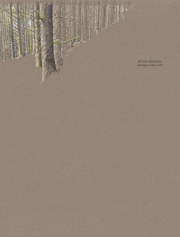
I almost always start in the upper left corner and work down and across, since I’m right handed, so I’m not dragging my hand over and over across finished portions. But it depends on my strategy for constructing the piece. That worked perfectly to start the forest in the upper left. Next I am going to work on Shasta. Then the bridge, and then fill in all the foliage around Shasta and the bridge. This is the first day’s work: the forest drawn in detail in the upper corner of the Canson paper. My drawings always start like this: the lights and darks, detailed outlines, made with a cream and a dark-grey pencil. Those shapes at the top of the paper with “x”s in them are noting where each whole tree trunk is. So all those vertical lines don’t get confusing while I’m trying to copy that dense forest from the reference photo.
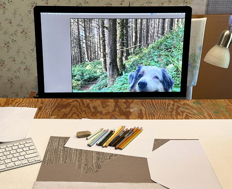
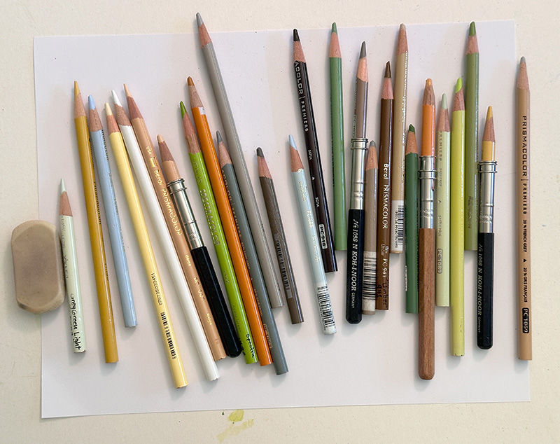
Working on the forest with my layout displayed on the monitor in front of me. The pencils I’m using are on a piece of white paper above the area I’m working on, and the rest of the Canson paper is covered with white paper to keep it clean.
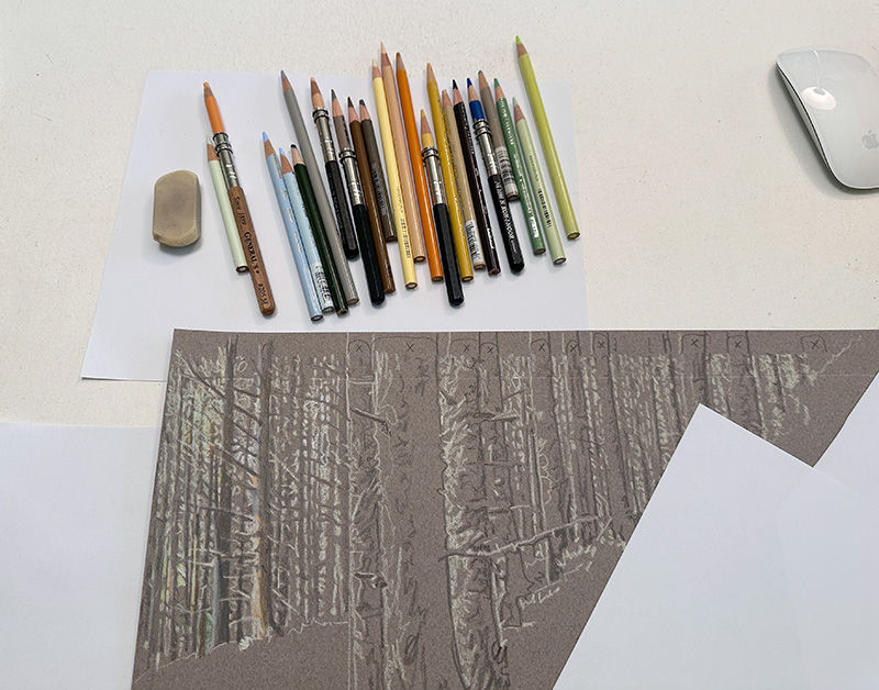
As I got further into the forest trees (working left to right) I pulled out more pencil colors. There is some pale foliage (greens) and distant blue sky (pale blues) showing between the trunks in a few places. Some of the sunlight on the trunks have orange and gold tones to it. In this photo I’m adding those colors in the farthest-left tree trunks.
This is where I quit for the day today. Photos taken with my phone in the studio while I’m working don’t show detail as well. Occasionally I make a high-resolution scan of the artwork on my professional-grade scanner after I finish that day’s work. It’s time-consuming because I have to scan it in 8 pieces and stitch them together with Photoshop. But it gives a very accurate and detailed reproduction of the artwork. This shows the entire sheet of Canson paper as it looks now. One more days’ work will finish the forest trees. It will go faster as I get toward the right because the trees get shorter and shorter!
I’m using the grey of the paper to give me a lot of the color I need for the tree trunks. These pencil colors provide sunlight on the trunks (yellows, pale orange, pale warm greys), the distant foliage and some moss on the trees (warm greens and muted greens), two shades of pale blue for a few bits of sky showing through the trees, and dark greys and browns for the shadowed side of the trunks and branches.
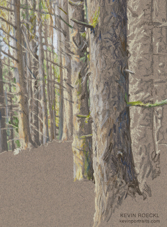
A closeup of the pencil work. You can see all those pencil colors I just showed you, put to good use on the grey paper.
Shasta portrait in progress 3
The forest trees are finished. This shows just the upper part of the artwork.
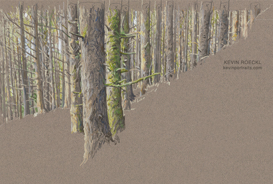
Next I’ll start on Shasta.
Shasta portrait in progress 4
Started working on Shasta’s head today.
When Diane saw these in-progress pics, she wrote:
“Looking good! EXCITING!!!!”
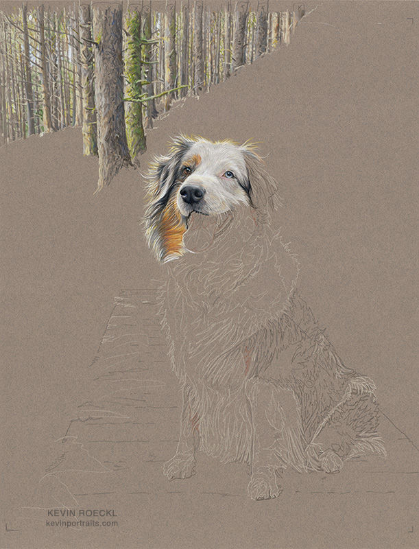
First I created the forest of tree trunks in the upper part of the artwork. Next I drew out detailed outlines of Shasta’s figure on the Canson paper with cream and dark grey pencils. Then I start filling in her tri-color coat.
I interrupted my work 3 times to scan the artwork to show the pencil-work being added…
1
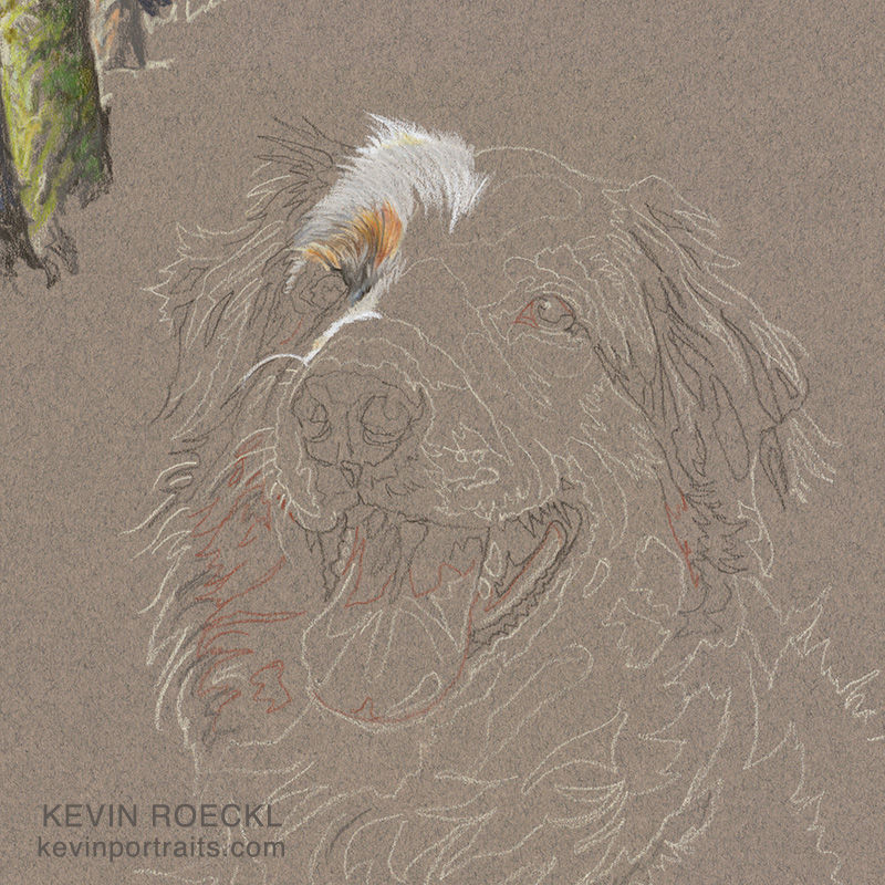
2
Shasta’s face is mostly white, with some red and grey on the left (her right) side. Both her ears are “merle” (black and grey). You may think I’ve put too much white on the outer edge of her ear…
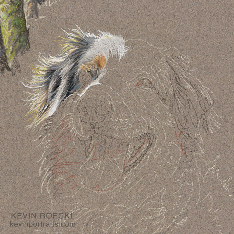
3
I used a lot of white on the left side of the ear because I want golden sunlight touching the side of Shasta's face, coming from the left like on the tree trunks. Those are back-lit hairs, on the side of her ear and across the top of her head. That will be toned down a bit when I do the ferns behind her.
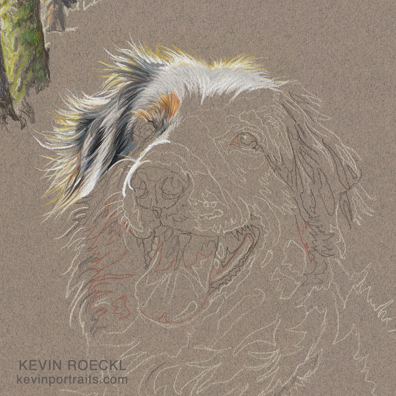
FOR ARTISTS:
Since the sunlit hairs must be white, as bright as I can make them, the rest of the white areas of Shasta’s face are actually pale grey. It’s a careful balancing act, because I want her face to look like the pure snowy white it is in life…but it has to be darker than the true white of those sunlit hairs on the top and side of her face, where the light is hitting. (You can see that on the side of her nose now too.) Artists call this “value control”. Values = how dark or light something is. Those who are sensitive to value will be able to see that Shasta’s white forehead in the picture above is slightly darker than the white of the backlit hairs on the top of her head. You can see the difference where those two values meet, and see that her “white” forehead is being rendered with a very pale grey.
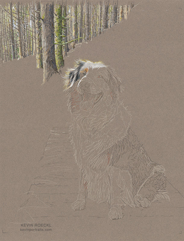
4
This shows the whole artwork as it looked when I stopped work for the day. Now the whole composition is starting to emerge, with beautiful Shasta on a little footbridge while hiking in the Vancouver Island forest with her beloved people.
Shasta portrait in progress 5
It’s the day I’m doing Shasta’s eyes. The most critical part of any portrait.
A whole bunch of reference photos are on the monitor to guide me. The main photo I’m using is at the bottom, with some others above it to help me get all the details of Shasta's tri-color/merle coat just right. And a whole column of ref pics showing Shasta’s eyes (far right on the monitor).
Why so many reference photos? I am mostly copying what I see in the main photo. But often photos are not as crisp as they could be. Many are taken with phones, sometimes low-resolution, "pixelated" when I zoom in to see details. Lighting may not always be the best, color might be off. By looking at other photos that show the feature at a similar angle, I can verify that I am capturing the color correctly, and that I am accurately seeing the curve of the upper eyelid, the amount of white showing on the eyeball, the color of skin by the inner corner of the eye, the shape of a slight shadow below the eye socket. These are things that are different with each individual. Capturing those tiny nuances are what make that individual look like "them".
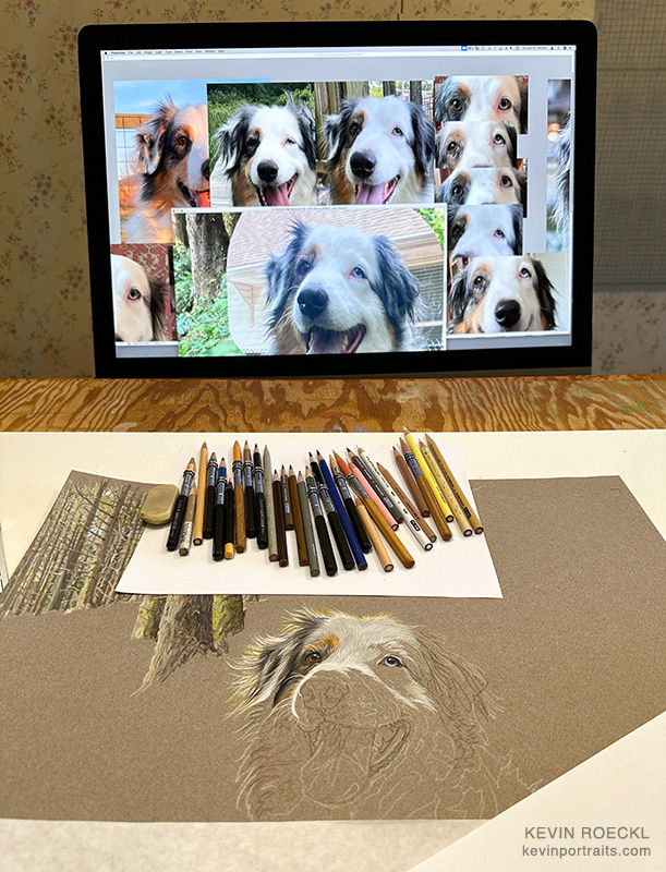
Now you can see why it was so important for me to see accurate photos of Shasta’s eyes.
A close-up of today’s work.
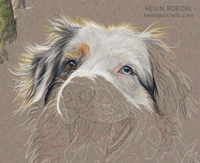
Prismacolor pencil on "Felt Grey" Canson paper.
Shasta portrait in progress 6
Today I'm adding Shasta’s tongue.
What color is a dog's tongue? Pink, you might say.
Is it really?
There are some colors in a dog’s tongue you might not expect.
This is how the portrait looked when I stopped working yesterday. Ready to start on Shasta's tongue today.
What color is a dog's tongue? Pink, you say? To find out, I “sampled” areas of the tongue in the reference photo with Photoshop. Then I put those swatches on the same grey as the paper I’m working on. Now I can see what color pencils I’ll need for the highlights, mid-tones, and shadow areas of Shasta’s tongue.
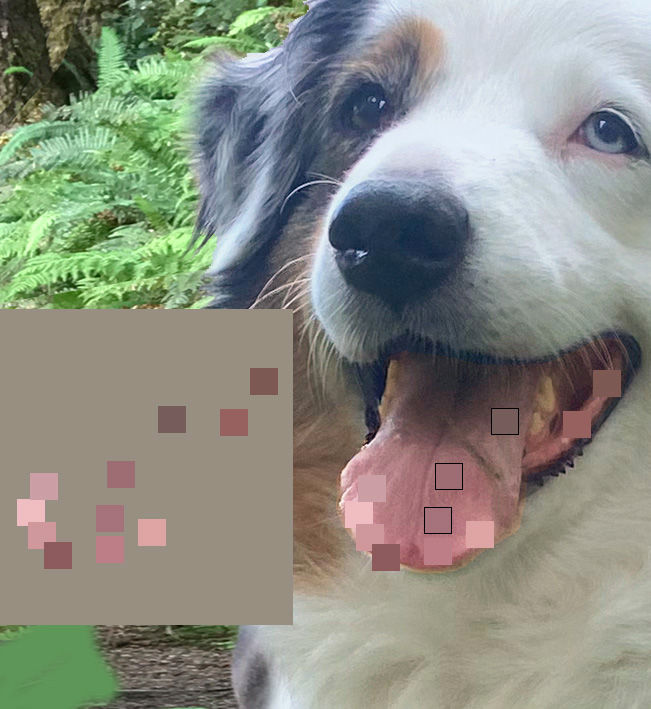
Are you surprised at some of those colors? Hardly any of them are what I would call “pink”.
FOR ARTISTS:
I sampled the tongue colors with Photoshop. If you have a print of your reference photo you can do the same thing by laying a piece of white paper over your reference photo with a little hole cut in it. Place that hole over different places on the tongue and see what color is actually showing in the hole. The white paper isolates it from other colors that could "fool" your eye. You can even try matching a pencil color to it by scribbling on the white paper next to the hole. This is a way of identifying the true color your eye is seeing. Then finding out what pencil color is closest to it.
Next...
In the studio, starting work on Shasta’s tongue. The strip of grey paper is one of my master-swatch strips, this one showing all the pinks, peaches, mauves, and purple pencils that I have. I’m looking at my swatches and picking out the pencil colors I’ll need.

I have just put in the edges of the tongue. First I outline the shape…it’s light and dark edges. Then I will work from light at the tip of the tongue, to dark inside her mouth.
For Shasta’s tongue, I needed to layer multiple pencil colors to get those subtle shades of mauve and muted pink-brown that are in her tongue. There was no one pencil that matched all my sampled swatches.
Tongue finished.

Shasta portrait in progress 7
Shasta’s happy smile is finished. This is how the whole portrait looks now.

Shasta portrait in progress 8
Cheryl sent me the most adorable picture of Shasta “belly up” on the chaise yesterday. I’ve come to know her through Cheryl’s and Tk’s words in emails from each of them. So I was not surprised to see the big happy smile on Shasta’s face. By now I've gotten a full understanding of why the particular photo we’re using for the portrait appealed to Tk. That smile is “pure Shasta”. And just a little bit of an impish twinkle in her eye.
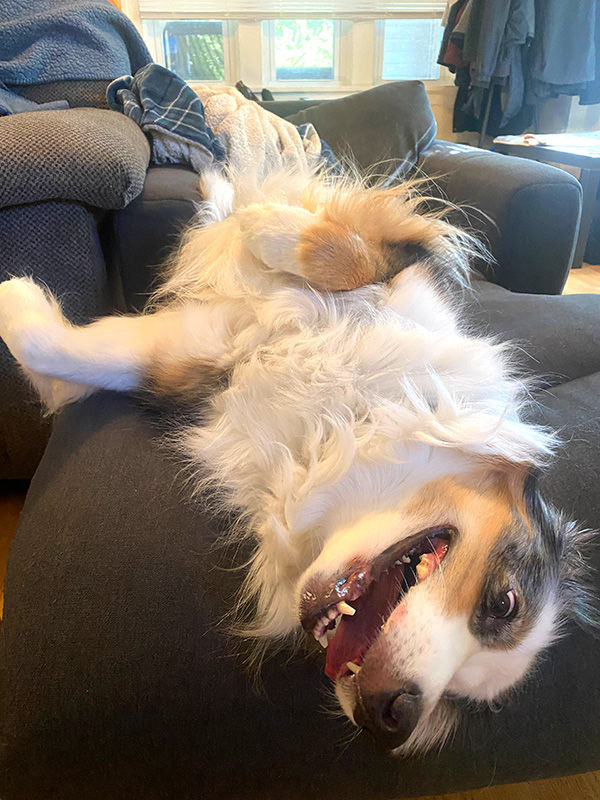
Diane Barnes ordered this portrait as a gift for her son Takeshi (Tk) and his fiancé Cheryl. Here are Tk’s and Cheryl’s words....
Tk wrote:
“Shasta has a very playful personality. Despite her age, she constantly gets mistaken for a much younger dog because of her bouncy, playful walk. Being a herding breed, she's also very watchful and attentive to what Cheryl and I are doing. I find it very amusing how she'll switch back and forth between her playful energy and her watchful stare.
She's also the laziest Aussie I've ever met. She finds the energy if it's something she wants to do but plays dumb if it's something she doesn't. She also likes to let out loud, almost human-like sighs whenever she lays down or gets up, which we find funny.”
Cheryl wrote:
“Shasta is now 10 years old, and I came into her life when she was 3 when I started dating Takeshi. They share one of the closest bonds I have ever seen between a pet and their owner. Shasta is incredibly loyal to those she loves, and I'm happy to say I think I count among them now. She's also one of the smartest dogs I know, though sometimes that intelligence comes with a bit of sass.
Takeshi and I met in my hometown of Victoria, and some of our earliest hangouts involved taking Shasta on hikes. It's something we loved doing then and continue to enjoy now, exploring the parks, trails, and neighbourhoods of wherever we happen to live.
Despite Shasta being 10 years old, I still often think of her as a young pup. However, don't be surprised if you find her belly up on the chaise lounge that she has now claimed as hers.
Shasta is the second dog I have had in my life, and I'm happy I get to share it with her.”
In the studio, I’m working on Shasta’s white ruff with reference photos of her on my monitor. Doing my best to capture her personality.

Shasta portrait in progress 9
Shasta’s white ruff is finished.
A set of custom notecards is included with my portraits. Usually the whole portrait is on the card. But I think just Shasta’s head in this close-up would make a perfect card. With the bits of background in the corners removed, just Shasta on grey background. I like the way her head forms a heart shape.
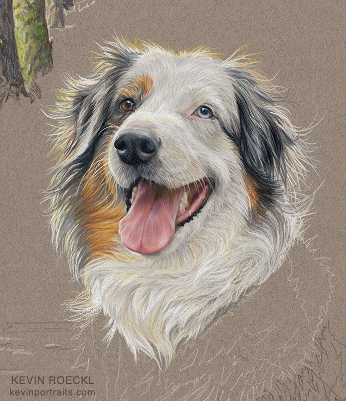
Colored pencil is great for doing hair and fur. You can see how I’m using the grey of the paper for the shadows that give shape to the white hairs in her coat.
Cheryl wrote:
“Wow wow wow!! Favourite progress update so far!!”
Shasta portrait in progress 10
After I finished Shasta’s head and neck, I continued working my way down her body. But I had to pause my pencilwork for a series of steps that were needed where the left edge of her coat meets the background. This is how I accomplished it:
1
I finished Shasta’s white ruff, except for the left edge where the sunlight coming from the left hits her coat. I didn’t do that part yet because the wooden planks of the bridge she’s sitting on are a grayish-blue, and I want to put a wash of blue over the grey paper in that area to give me the right color for the bridge. That will save me coloring in that whole space with grey-blue pencils. However, there is a snag.
I will have to use white pencil to get the brightest white possible on the left side of Shasta’s ruff, lit by sunlight. If I do that, then add a blue wash over that edge (not painting painstakingly around each hair), it will tint the white pencil blue, as well as the grey paper.
So I’ve left that side unfinished, until I complete the next step….
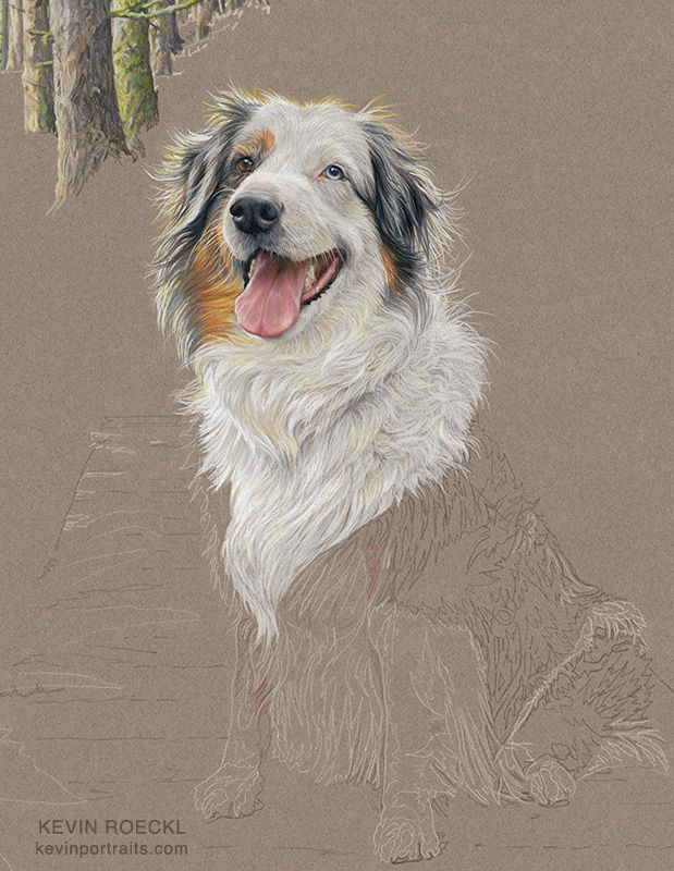
2
Watercolor wash added to the grey paper to make the bridge.
Part of that wash covers the area where white pencil would have been if I had finished Shasta’s white ruff all the way to it’s left edge.
For the wash I used white paint thinned with water for the upper part, and blue wash made with a mix of ultramarine blue and black paint (but mostly water). Just enough to “tint” the grey paper. That gives a nice blue-grey. It looks too blue right now, against the untouched grey paper around it….but when the green leaves are all filled in, the bridge will look like grey planks in shadow. Those gaps on the left side are where ferns will overlap the planks.

3
After the wash dried I was able to do the white pencil-work OVER the blue-tinted paper, instead of blue wash going over the white pencil. Which would have made Shasta’s hair light blue on that side. This is how I plan a “strategy” for an artwork, thinking about the order of the steps before I do them.
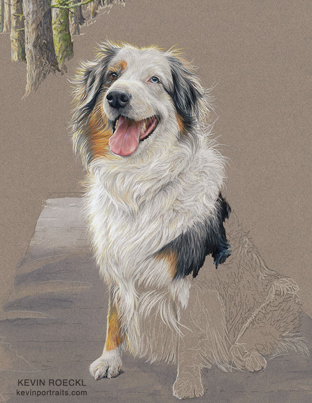
Now you can get more of a sense of the sunlight hitting Shasta from the left side.
4
The whole artwork as it looks now. I continue working my way down and across Shasta’s body. Front legs in progress now. There is more white than necessary on the left side of Shasta’s head because I exaggerated the amount of white I’ll need there. When I add the greens in the background it will knock some of that back.
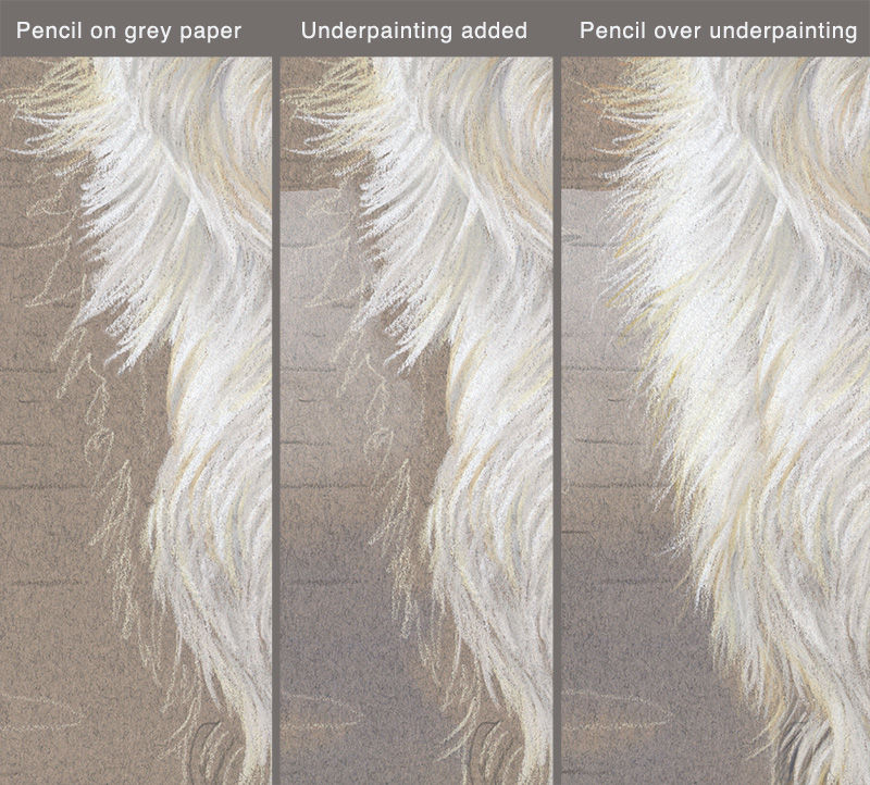
Below is a close-up of the steps:
STEP 1 - I paused the pencil work to leave space along that left edge.
STEP 2 - Watercolor wash added. As you see, it infringes into the area of the ruff.
STEP 3 - The wash has dried, and I finish the brightly-lit edge of Shasta’s soft white ruff, making pencil strokes OVER the blue wash.
Shasta portrait in progress 11
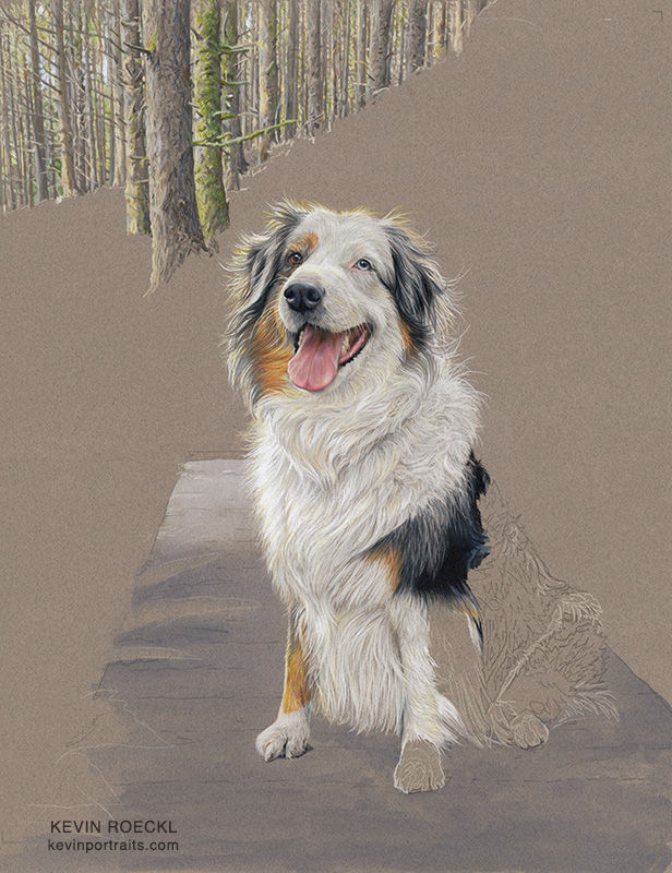
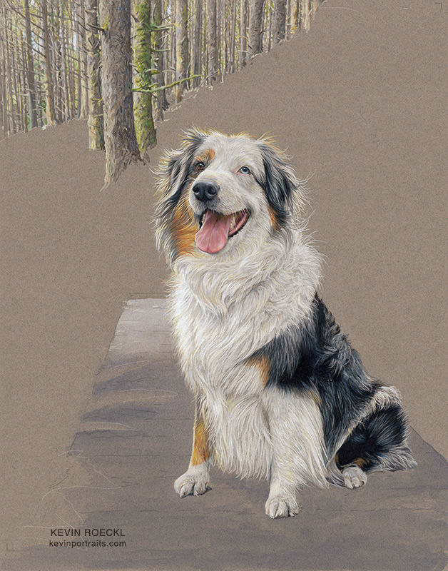
Shasta herself is finished. I always love the way it looks when the subject is “3-dimensional” on the flat grey paper! Next I’ll start on the ferns and hiking trail. There's a lot of blank grey paper that has yet to be filled in.
There are a couple things I want to fix about Shasta. The shadow on the back of her orange foreleg makes her leg look too thin. (Big foot, skinny little leg.) And I need to add that other toe to her back foot where it’s covered by hair. Looks like she only has 3 toes.
Next, the background scene...
1
I sketched in some of the forest background.…lights and darks to help orient me with regard to the path, the ferns, leaves, and hillsides. And the curving shape of the path. I’ve faintly marked the posts that held up the railing of the bridge – which I've removed in the artwork – but they are there in the reference photo, and that will help guide me as to where I'm at in the image.
2
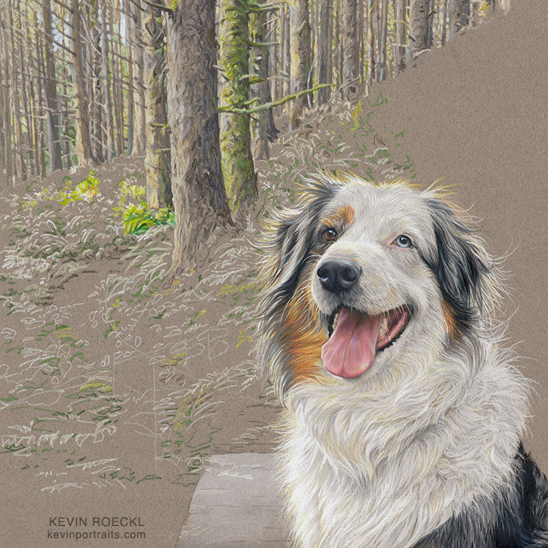
Now I start filling in the greens of the forest, starting in the upper left below the tree trunks. Greens, yellows, golds. As usual, I work down and across from the upper left, because I’m right-handed. So I don’t drag my hand repeatedly across the finished parts. This close-up shows some of the pencil-work. I’m not working as tightly detailed as I did on Shasta, the main subject.
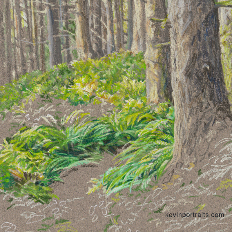
3
Same as the previous pic but with the open spot in the center filled in. What a difference some green pencil makes. The forest floor comes to life.
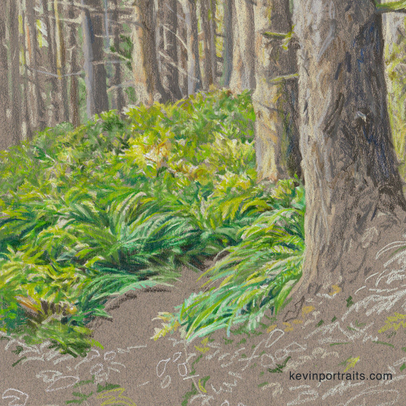
4
The background scene starts to look 3-dimensional....
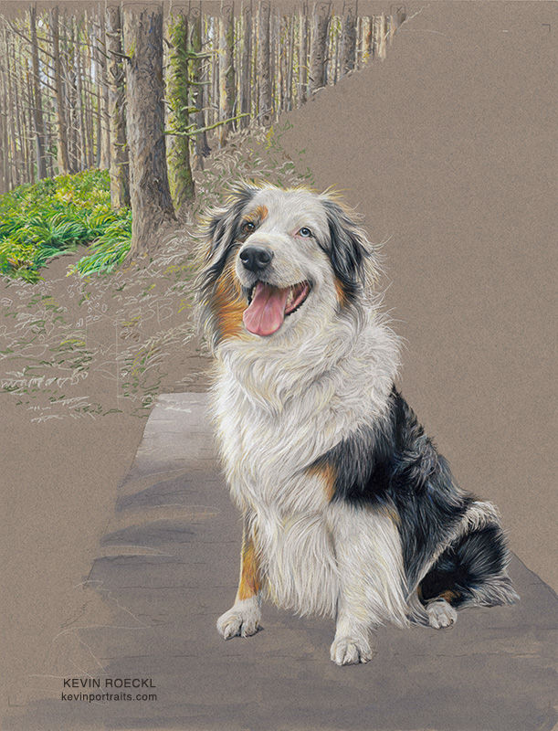
Shasta portrait in progress 12
Carefully working the greens of the background around the back-lit hairs of Shasta's ears. Unlike the underpainting technique on the wispy edge of Shasta’s chest, filling in around the hairs with pencil requires some careful and precise work. Much slower going than the underpainting, which is the reason I use that technique (when I can).
This close-up shows the pencilwork. I’ve sketched in lights and darks of the forest background on the grey paper to help guide me as I fill in the detailed greens of the forest. You can see how many different green pencils I’m using just in this small detail. Warm greens, cool greens, light and dark greens, and some golds and green-browns.
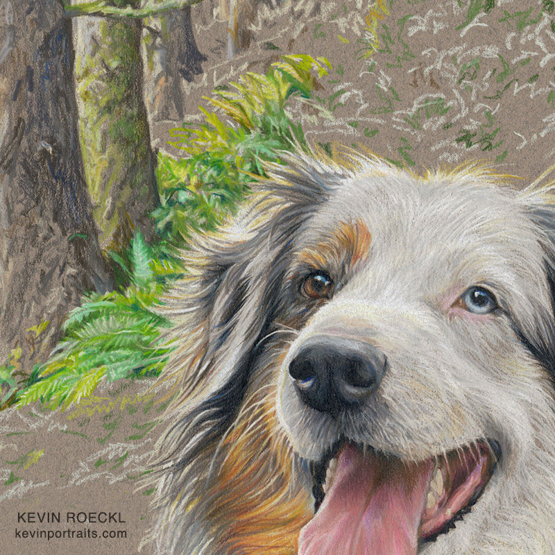
Unlike the ferns I showed in the previous step, to the left of the tree trunks, this part I'm working on now is much more painstaking. Because I want Shasta to be perfect. The whole purpose of the background in a portrait is to frame the subject.
Shasta portrait in progress 13
Here's some good color info for artists...
This photo taken in the studio shows some of the greens I’m using. Warm greens and cool greens. Many non-artists think of “green” as a cool color. (Red, for example, is considered a warm color.) If you’re not sure what the difference is between a “warm green” and a “cool green”, this pic shows it pretty clearly. Warm greens, on the left, have a lot of yellow, gold, or red in them — warm colors. Cool greens have a lot of blue - a cool color - in them. Cooler greens shade toward aqua (more and more blue). Warm greens shade toward chartreuse (more and more yellow).
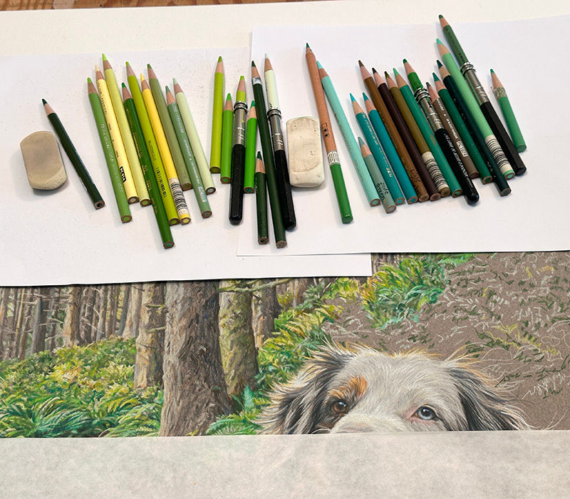
In this close-up you can see some of the cool greens next to warm greens, in that section of completed leaves that is “floating” by itself to the right of Shasta’s head. The cool green leaves are in shadow, and the warm greens “behind” them (artistically, “around” them) are in sunlight. Sun is coming through the tree trunks in patches, lighting up some leaves and ferns but not others. Warm greens show where shafts of sunlight are hitting the forest floor. The ferns in shade are cooler greens. Colors in shade are always cooler.

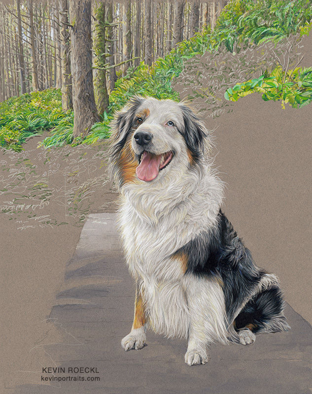
Putting in the ferns is going more slowly than I expected, working the colors of the background very carefully around the back-lit hairs of Shasta’s head. Shasta is the subject of the artwork, so I want her details to be as precise and perfect as possible.
Shasta portrait in progress 14
I’m working on the path now, to the left of Shasta. Here’s today’s work...
1
You can see the curved lines of the path (sketched in with pale yellow pencil) as it comes around the tree.

2
Notice how I used the grey of the paper as the main color of the path. Then I just threw on some dots and dashes of pencil strokes in a few different golds, browns, and greys to give the path texture. The impression of some pebbles, fir-tree needles, and bits of fallen leaves on a forest trail.
I chose grey paper for this portrait for a number of reasons. This was one of them.

Shasta portrait in progress 15
This shows the entire portrait as it looks now. There is a diagonal line of bright yellows going to the right and up from Shasta’s head. That is part of what defines the landscape and keeps it from being just a jumble of different greens. (Which it is.)
That diagonal line is important in the composition. It leads your eye to Shasta’s face. And adds interest to the masses of green foliage. Diagonal lines add a dynamic tension to a composition that would otherwise be a wallpaper of busy details. Vertical lines and curves serve a different purpose in a composition. You can see that in the upper half of the artwork.
I think of those lines - horizontal, vertical, diagonal, and curved - as the “flow” of a composition. In a portrait, all lines and shapes should carry your eye to the subject. But it would be silly just to have a bunch of straight lines pointing like arrows to the subject. The curves, lines, and shapes - the “flow” - add interest and tell the story of what you are seeing. In this portrait the story is Shasta’s hike through the forests of Vancouver Island with her beloved people.
Can you see the way vertical lines (tree trunks), diagonal lines, and a curved line (the path) carry your eye and frame Shasta’s face?

There’s still a lot of blank grey paper to fill in. A ways to go yet on the landscape.
Shasta portrait in progress 16
I’ve decided to put in a green underpainting in the lower part of the scene. It has been a lot of work to cover so much grey paper completely with green pencils. A green underpainting will save me a lot of time. I knew this. I just thought I could get away with not doing it. 😉
In a previous step I put a transparent blue watercolor wash on the footbridge, to tint the grey paper blue-ish. That’s an “underpainting”; I’ll make planks and wood-grain with colored pencils over it.
Now I’ve worked my way down to where most of the greens left to do are medium-to-dark cool green. After sketching in some of their leaves with light and dark pencils (to orient me), I added a green underpainting - a green watercolor wash. As you see here. Now I can make pencil strokes on “green paper” instead of grey paper. That will make all those cool-green leaves easier to do.

The only place the original grey paper is still showing is in those grey leaves to the right of Shasta’s shoulder. I didn’t put a cool green wash there because those leaves will be warm greens (yellow greens). Those colors are brighter when working directly on the grey paper, rather than over a blue-green.
Shasta portrait in progress 17
Putting in the ferns with colored pencil over the green underpainting. And over the blue-grey underpainting I had done previously on the bridge. The original grey of the paper is only visible at the bottom edge of this pic, (just to the left of the “k” in kevinportraits).

I haven’t yet added pencil-work to the bridge: the gaps between planks, wood grain, little bits of fallen leaves, and the shadows under Shasta that will tie her to the bridge’s surface. First I have to finish the ferns and foliage on both sides of the bridge, because I’m doing green colored pencil over the blue-grey to make ferns overlapping the planks. The bridge will be the very last thing I do to finish Shasta’s portrait.
Shasta portrait in progress 18
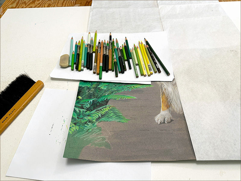
I’m finally getting down to the wire with this portrait. The ferns on the left are finished.
1
Working my way down to the bottom corner.
I get scribbley at this point. Subject is in sharp focus, meticulous detail….the farther I get out to the edges/corners of the landscape, the looser I get with the pencil-work. After driving myself crazy for weeks with all the tight detail…I will just scribble my way across the bottom with big scribbley scribbles! 😁
2
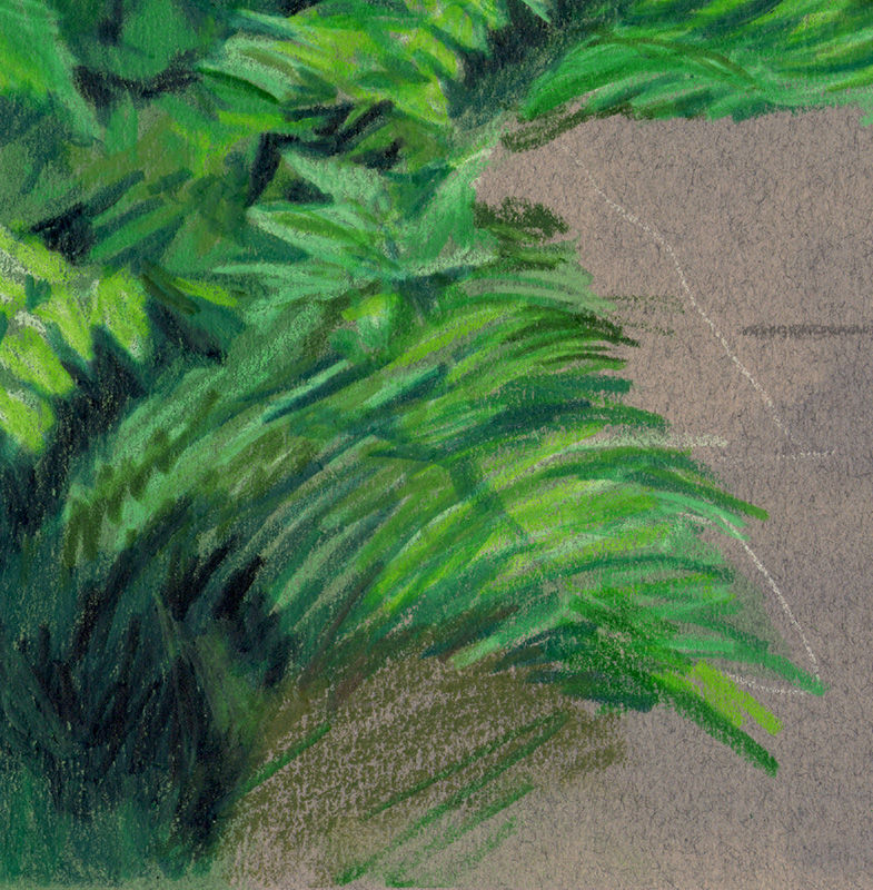
This last fern went really fast. Compared to the slow, painstaking work of the others.
Just a few fast scribbles in the right place with the right colors.
3
Everything to the left of the bridge is finished.
Shasta looks like she is floating, because there is no shadow under her to tie her to the surface she’s on. That’s one of the things an artist has to know to make a scene look realistic when putting a subject from one reference photo (a dog on it’s front lawn) into a scene from a different reference photo (footbridge and trail through a forest).
Shasta portrait in progress 19
A zillion ferns 🤣 in this portrait will soon be completed.
These 3 pics show how those last leaves are filled in, with one last design challenge to be solved....
1
For the background scene, I worked my way downward from the top, filling in all the details of the forest with colored pencils over grey Canson paper. At this point I added a green watercolor wash to tint the grey paper green. The colors transition from warm greens (the pencilwork leaves) to cool, darker greens. This green underpainting will save work trying to cover every speck of grey (which is warm) with cool-green pencils. I left a few gaps in the underpainting where I want warmer green leaves.
Now there’s a design challenge:
I know from my reference photo that the leaves in this remaining area have a lot of dark green and black. But now they’re up against Shasta’s black back. How will I make her black body stand out from a black background?

2
To make Shasta stand out I made sure that the values “touching” her were either lighter or darker than her black coat. “Value” means how light or dark a color is. If Shasta’s back and the background leaves were the same dark value, it would be hard to tell where Shasta ends and the leaves begin. Since this a portrait, it’s important that Shasta stand out.
So I didn’t follow my reference photo exactly. In the photo there were no light-colored ferns adjoining the edge of her back. I made those a lighter value than her coat. In the reference photo the leaves were darker.

3
Shasta’s body is black, but there are lighter greys on her lower back and a splash of white over her hip. I was able to finish the foliage going into dark greens and black where it dips beneath the bridge. This little detail of the edge of Shasta’s back was something I planned when I designed the composition. I foresaw that black-on-black problem. So when I worked on Shasta I exaggerated the lighter greys of her lower back that I saw in her reference photo.
Then I was able to put black “behind” (adjoining) her black coat, yet there is a clear edge.

Not much left to go now. The footbridge is all that’s left to do. I already tinted it blue-grey in an earlier step, by putting a transparent blue watercolor wash over the grey Canson paper. I just need to add a few details over that with colored pencil. And a shadow under Shasta to tie her to the bridge surface.
Shasta portrait in progress 20
I’m down to the final part of Shasta’s portrait: the footbridge.
1
The bridge is composed of the original grey paper color, slightly tinted blue by adding a wash of transparent blue watercolor thinned a lot with water. And a little bit of white watercolor at the far end of the bridge. This gave me my basic color for the bridge. I had planned that from the time I chose grey as the paper color to use for Shasta’s portrait. I chose that color for many reasons. The tree trunks, the path, the bridge, and Shasta, are the places I used that grey of the paper.

This BEFORE picture looks pretty good as it is. It looks like a bridge. But the final details will really make it look realistic.
2
This is a good example of using paper color in a background. In the previous pic you saw the basic “bridge shape” of blue-grey. That would have been a large shape to color in completely with colored pencils. So I made the paper color do the work.
Just adding a few well-placed pencil strokes over that color makes the wooden bridge realistic. Some jots and dashes make fallen fir-needles, a few rough lines indicate the planks. Adding a shadow under Shasta really worked some magic. In the BEFORE pic she looks like she is floating above the bridge. The shadow beneath her ties her to the wooden surface. In art, no object looks like it is on a surface unless there is a shadow.

Details:
This “Felt Grey” Canson paper is particularly well-suited for the bridge because it has little flecks and fibers in it that give the feel of weathered wood. You can see those paper fibers in the following close-ups.…
The colored pencil details. Just a few dots and dashes make fallen fir-needles and wooden planks on the grey paper. And the shadow added carefully under Shasta.

This detail really gives you a good look at the dots and dashes. They didn't take long to do.

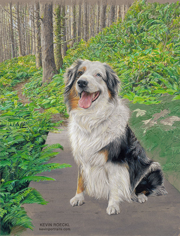
Shasta portrait finished!
A little background about Shasta...
Shasta is 11 years old. Her portrait was commissioned by Diane Barnes as a gift to her son Takeshi, and his fiancé Cheryl who became part of Shasta’s life when she started dating Takeshi (Tk).
Tk and Cheryl met in Victoria on Vancouver Island, Canada. Some of their first dates were hikes with Shasta in the Vancouver Island forests. This portrait captures Shasta on one of those hikes, with her big Shasta smile and twinkling eyes.
Before I portrayed Shasta I asked Tk and Cheryl to tell me about her. Their words are below the portrait.

TK wrote:
“Shasta has a very playful personality. Despite her age, she constantly gets mistaken for a much younger dog because of her bouncy, playful walk. Being a herding breed, she's also very watchful and attentive to what Cheryl and I are doing. I find it very amusing how she'll switch back and forth between her playful energy and her watchful stare.
She's also the laziest Aussie I've ever met. She finds the energy if it's something she wants to do but plays dumb if it's something she doesn't. She also likes to let out loud, almost human-like sighs whenever she lays down or gets up, which we find funny.”
CHERYL wrote:
“Shasta is now 10 years old, and I came into her life when she was 3 when I started dating Takeshi. They share one of the closest bonds I have ever seen between a pet and their owner. Shasta is incredibly loyal to those she loves, and I'm happy to say I think I count among them now. She's also one of the smartest dogs I know, though sometimes that intelligence comes with a bit of sass.
Takeshi and I met in my hometown of Victoria, and some of our earliest hangouts involved taking Shasta on hikes. It's something we loved doing then and continue to enjoy now, exploring the parks, trails, and neighbourhoods of wherever we happen to live. Despite Shasta being 10 years old, I still often think of her as a young pup. However, don't be surprised if you find her belly up on the chaise lounge that she has now claimed as hers. Shasta is the second dog I have had in my life, and I'm happy I get to share it with her.”
“Shasta”
20 x 26 inches
🎨 Prismacolor pencil on grey Canson Mi-Teintes paper, with watercolor underpainting.
Shasta's portrait is a "Fully Detailed Background" portrait. You can read about my types of portraits, and see galleries of examples HERE.

Comments